Bootstrap Table Template
Overview
Tables are existing in most applications (web, desktop or mobile program) and they are a main element in showing information to the final user. The HTML tables are really used to present information in framework manner such as columns and rows . With using Bootstrap 4 framework you are capable to easily increase the appeal of the table.
In the present day, with the significance that the user interface has, knowing how to enhance the look of a Bootstrap table becomes as relevant as it is. In this case, one of the systems that have come to be reference is Bootstrap. This front-end framework, along with a lot of other features , offers a number of components for designing and optimising the presentation of various components, such as tables.
Basic table in Bootstrap
To format a table with Bootstrap, simply incorporate the table class to the
<table>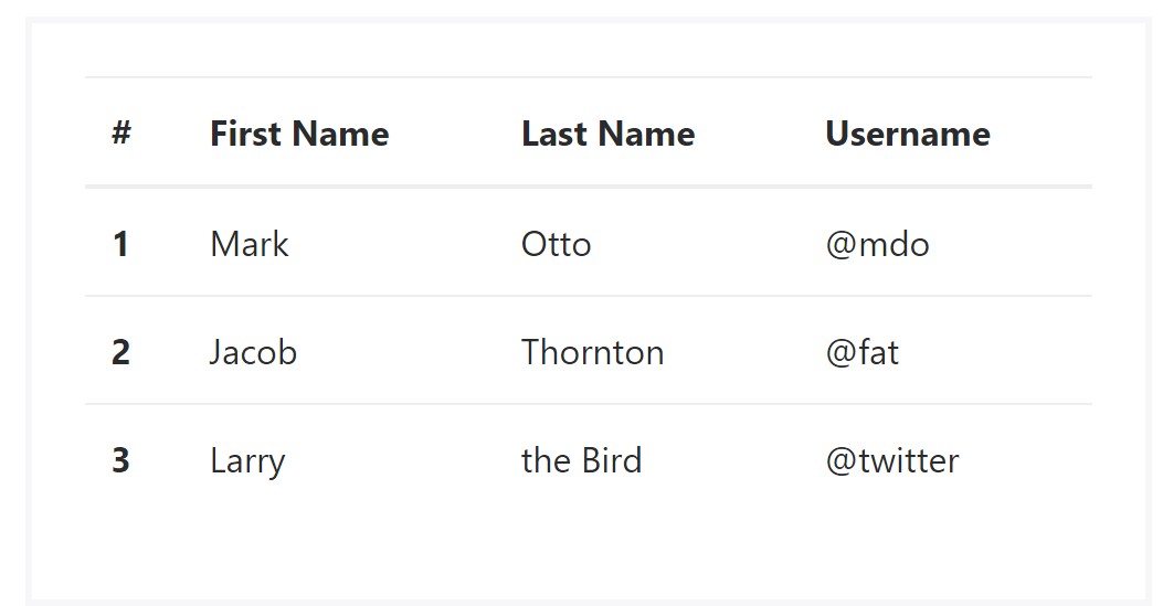
<table class="table">
  <thead>
    <tr>
      <th>#</th>
      <th>First Name</th>
      <th>Last Name</th>
      <th>Username</th>
    </tr>
  </thead>
  <tbody>
    <tr>
      <th scope="row">1</th>
      <td>Mark</td>
      <td>Otto</td>
      <td>@mdo</td>
    </tr>
    <tr>
      <th scope="row">2</th>
      <td>Jacob</td>
      <td>Thornton</td>
      <td>@fat</td>
    </tr>
    <tr>
      <th scope="row">3</th>
      <td>Larry</td>
      <td>the Bird</td>
      <td>@twitter</td>
    </tr>
  </tbody>
</table>
Inverse tables.
Among the fresh tables in Bootsrap 4 is the inverse tables. Class
.table-inverse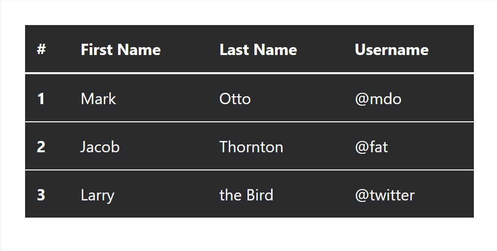
<table class="table table-inverse">
  <thead>
    <tr>
      <th>#</th>
      <th>First Name</th>
      <th>Last Name</th>
      <th>Username</th>
    </tr>
  </thead>
  <tbody>
    <tr>
      <th scope="row">1</th>
      <td>Mark</td>
      <td>Otto</td>
      <td>@mdo</td>
    </tr>
    <tr>
      <th scope="row">2</th>
      <td>Jacob</td>
      <td>Thornton</td>
      <td>@fat</td>
    </tr>
    <tr>
      <th scope="row">3</th>
      <td>Larry</td>
      <td>the Bird</td>
      <td>@twitter</td>
    </tr>
  </tbody>
</table>
Various other classes
For tables there are additionally some classes that help you to use other styles to a table ( read more here), they are:
●
table-striped●
table-bordered●
table-hover●
table-condensedTo apply these looks, just add the wanted classes to the: <table>: <table class="table table-striped table-bordered table-condensed table-hover">
Table head features
Much like default and inverted tables, use one of two modifier classes to get
<thead>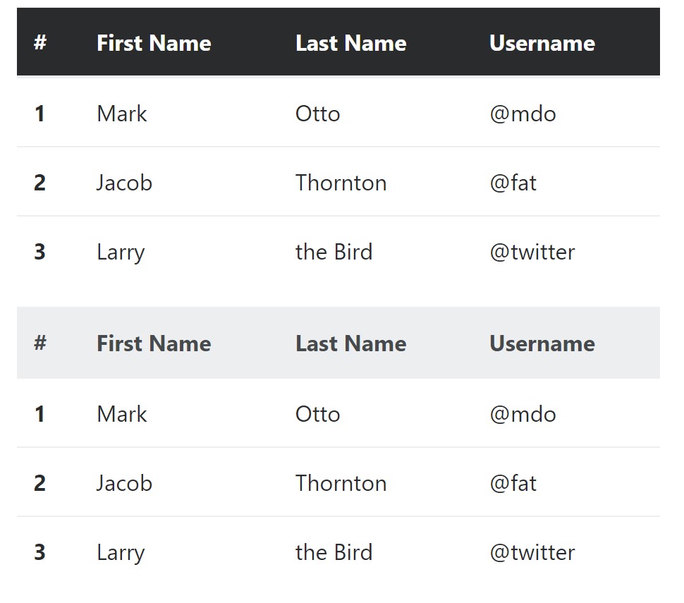
<table class="table">
  <thead class="thead-inverse">
    <tr>
      <th>#</th>
      <th>First Name</th>
      <th>Last Name</th>
      <th>Username</th>
    </tr>
  </thead>
  <tbody>
    <tr>
      <th scope="row">1</th>
      <td>Mark</td>
      <td>Otto</td>
      <td>@mdo</td>
    </tr>
    <tr>
      <th scope="row">2</th>
      <td>Jacob</td>
      <td>Thornton</td>
      <td>@fat</td>
    </tr>
    <tr>
      <th scope="row">3</th>
      <td>Larry</td>
      <td>the Bird</td>
      <td>@twitter</td>
    </tr>
  </tbody>
</table>

<table class="table">
  <thead class="thead-default">
    <tr>
      <th>#</th>
      <th>First Name</th>
      <th>Last Name</th>
      <th>Username</th>
    </tr>
  </thead>
  <tbody>
    <tr>
      <th scope="row">1</th>
      <td>Mark</td>
      <td>Otto</td>
      <td>@mdo</td>
    </tr>
    <tr>
      <th scope="row">2</th>
      <td>Jacob</td>
      <td>Thornton</td>
      <td>@fat</td>
    </tr>
    <tr>
      <th scope="row">3</th>
      <td>Larry</td>
      <td>the Bird</td>
      <td>@twitter</td>
    </tr>
  </tbody>
</table>
Striped rows
Zebra-like stripes may be put with the
.table-striped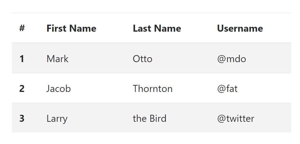
<table class="table table-striped">
  <thead>
    <tr>
      <th>#</th>
      <th>First Name</th>
      <th>Last Name</th>
      <th>Username</th>
    </tr>
  </thead>
  <tbody>
    <tr>
      <th scope="row">1</th>
      <td>Mark</td>
      <td>Otto</td>
      <td>@mdo</td>
    </tr>
    <tr>
      <th scope="row">2</th>
      <td>Jacob</td>
      <td>Thornton</td>
      <td>@fat</td>
    </tr>
    <tr>
      <th scope="row">3</th>
      <td>Larry</td>
      <td>the Bird</td>
      <td>@twitter</td>
    </tr>
  </tbody>
</table>
Hover Rows
To create a hover effect in the rows of your table include the
.table-hover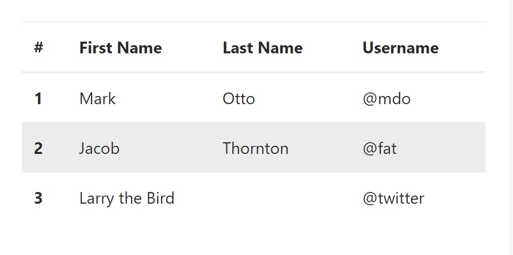
<table class="table table-hover">
  <thead>
    <tr>
      <th>#</th>
      <th>First Name</th>
      <th>Last Name</th>
      <th>Username</th>
    </tr>
  </thead>
  <tbody>
    <tr>
      <th scope="row">1</th>
      <td>Mark</td>
      <td>Otto</td>
      <td>@mdo</td>
    </tr>
    <tr>
      <th scope="row">2</th>
      <td>Jacob</td>
      <td>Thornton</td>
      <td>@fat</td>
    </tr>
    <tr>
      <th scope="row">3</th>
      <td colspan="2">Larry the Bird</td>
      <td>@twitter</td>
    </tr>
  </tbody>
</table>
Bordered Table
You are able to add in the borders on each and every table slide and a cell through the
.table-bordered
<table class="table table-bordered">
  <thead>
    <tr>
      <th>#</th>
      <th>First Name</th>
      <th>Last Name</th>
      <th>Username</th>
    </tr>
  </thead>
  <tbody>
    <tr>
      <th scope="row">1</th>
      <td>Mark</td>
      <td>Otto</td>
      <td>@mdo</td>
    </tr>
    <tr>
      <th scope="row">2</th>
      <td>Mark</td>
      <td>Otto</td>
      <td>@TwBootstrap</td>
    </tr>
    <tr>
      <th scope="row">3</th>
      <td>Jacob</td>
      <td>Thornton</td>
      <td>@fat</td>
    </tr>
    <tr>
      <th scope="row">4</th>
      <td colspan="2">Larry the Bird</td>
      <td>@twitter</td>
    </tr>
  </tbody>
</table>
Condensed Table
Wherever you wish to make your table a lot more small - on that occasion you will be able to cut cell padding in half by having this class:
.table-condensedBear in mind that, while Bootstrap 4 uses
.table-sm.table-condensed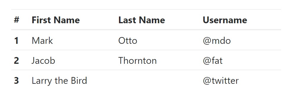
<table class="table table-sm">
  <thead>
    <tr>
      <th>#</th>
      <th>First Name</th>
      <th>Last Name</th>
      <th>Username</th>
    </tr>
  </thead>
  <tbody>
    <tr>
      <th scope="row">1</th>
      <td>Mark</td>
      <td>Otto</td>
      <td>@mdo</td>
    </tr>
    <tr>
      <th scope="row">2</th>
      <td>Jacob</td>
      <td>Thornton</td>
      <td>@fat</td>
    </tr>
    <tr>
      <th scope="row">3</th>
      <td colspan="2">Larry the Bird</td>
      <td>@twitter</td>
    </tr>
  </tbody>
</table>
Contextual Classes of Bootstrap Tables Editable
Use the contextual classes to color a table cells (
<td><tr>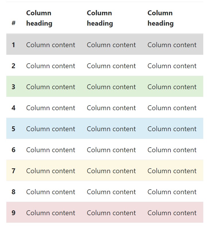
<!-- On rows -->
<tr class="table-active">...</tr>
<tr class="table-success">...</tr>
<tr class="table-warning">...</tr>
<tr class="table-danger">...</tr>
<tr class="table-info">...</tr>

<!-- On cells (`td` or `th`) -->
<tr>
  <td class="table-active">...</td>
  <td class="table-success">...</td>
  <td class="table-warning">...</td>
  <td class="table-danger">...</td>
  <td class="table-info">...</td>
</tr>
Changing the rows of a table Bootstrap 3 does not make use of the
.table-.active.table-active● active: Uses the focus color option to the table row or table cell
● success: Signifies a successful or positive action
● info: Indicates a neutral information change or action
● warning: Signifies a warning that you might need attention
● danger: Indicates a dangerous or potentially negative action
Responsive Tables
To create a responsive table - use the
.table-responsive
Bootstrap 4 allows you to add the
.table-responsiveCheck a number of video clip guide relating to Bootstrap 4 tables
Linked topics:
Bootstrap Table Design
__
W3schools:Bootstrap table tutorial
Bootstrap Tables Lecture